
When the Development Was Premium, the Brochure Had to Match.
Project: Property Marketing Brochure Design
Type: Terrace Duplex Development | Lekki Peninsula Scheme 2
Grace Yard had everything a buyer looks for: a desirable Lekki address, spacious duplex layouts, six exclusive units, and modern amenities worth showcasing. What it didn't have was a way to show any of that clearly. The developer came to us with architectural drawings and a collection of scattered project notes. For any brokerage team trying to sell this development ahead of completion, that's a problem. Not because the project wasn't strong, but because there was no single tool that could communicate how strong it was. Without a properly designed brochure: 1. Brokers would be walking into presale conversations without a strong visual anchor 2. Buyers would be asked to commit to a space that only existed on paper—a friction point that creates hesitation 3. The premium positioning of the development wasn't being communicated at a premium level The gap between what Grace Yard was and what its materials communicated was costing the developer in time, trust, and sales velocity.
We designed a full property marketing brochure that turned Grace Yard from a collection of project files into a compelling, sale-ready presentation.
1. Built a sales narrative, not just a layout
We structured the brochure to take buyers on a journey—from project introduction through location advantages, interior spaces, floor plans, and investment details.
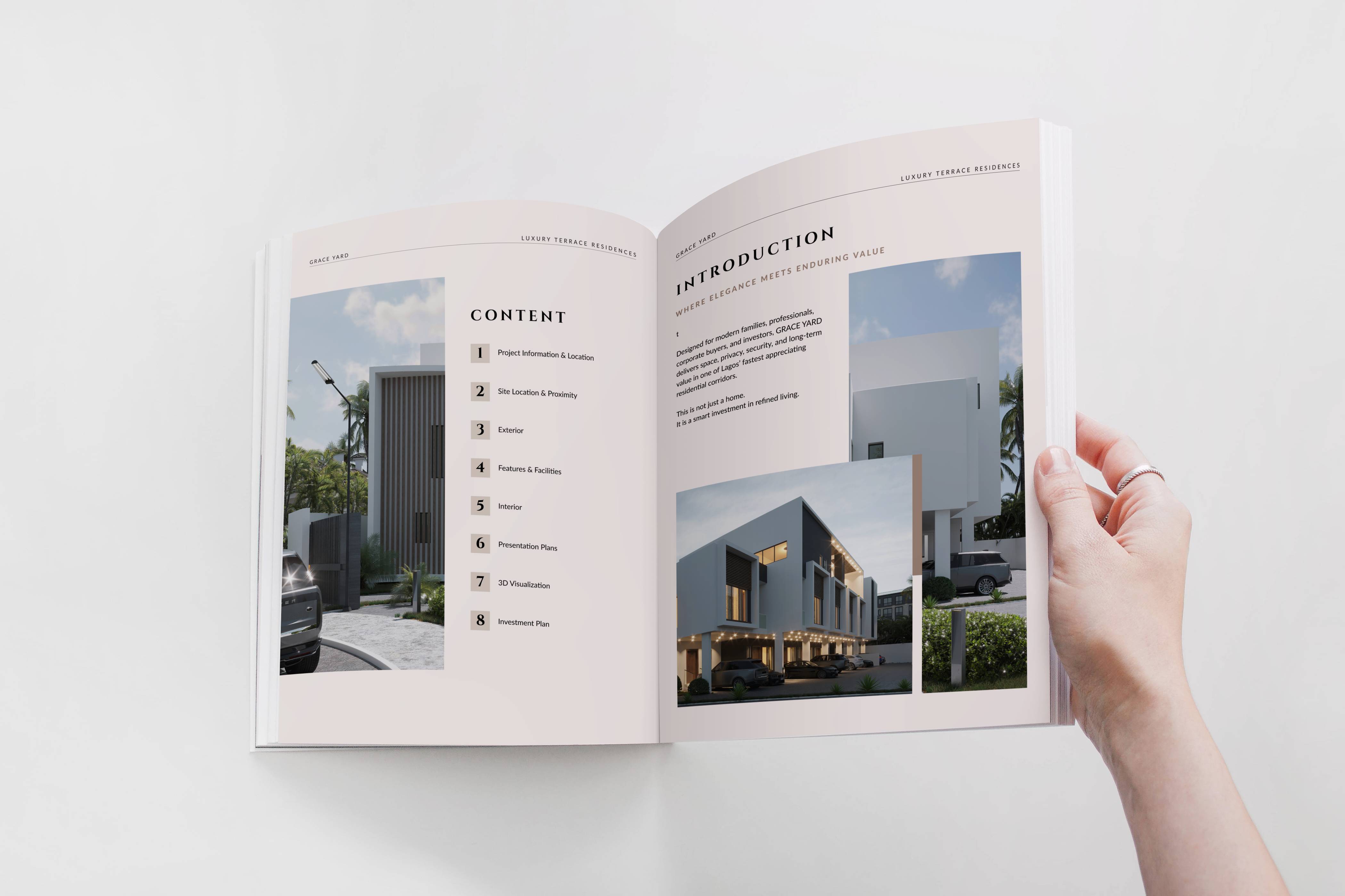
Every section flows logically into the next, supporting the kind of conversation that ends in a decision.
2. Made the floor plans feel like homes
Realistic floor plan renderings were integrated to replace cold technical drawings with visuals that helped buyers actually see the spaces.
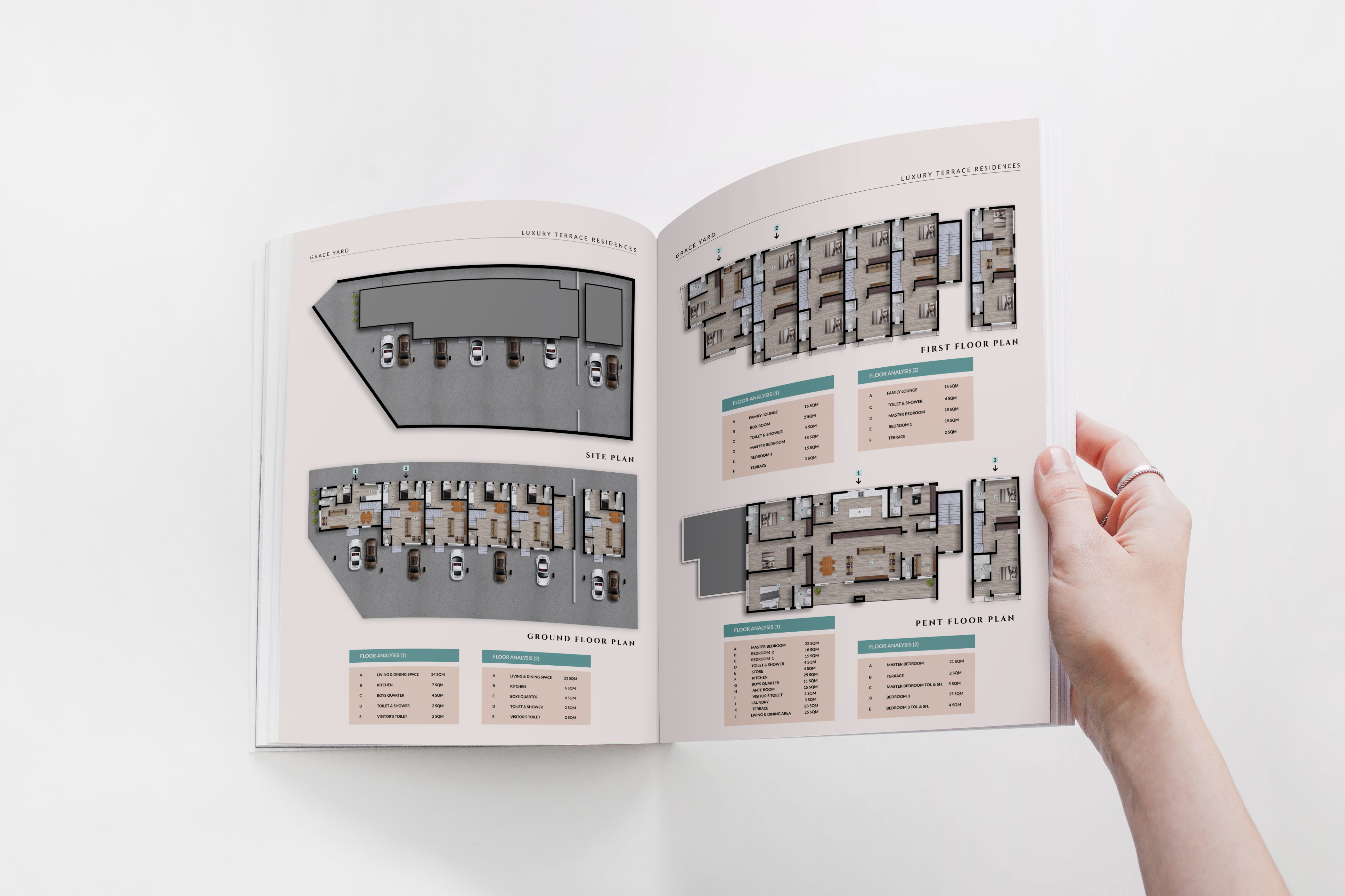
When buyers can imagine the living experience, they move faster.
3. Designed for premium perception
The visual language of the brochure—typography, layout, color palette, spatial hierarchy—was built to match the caliber of the development.
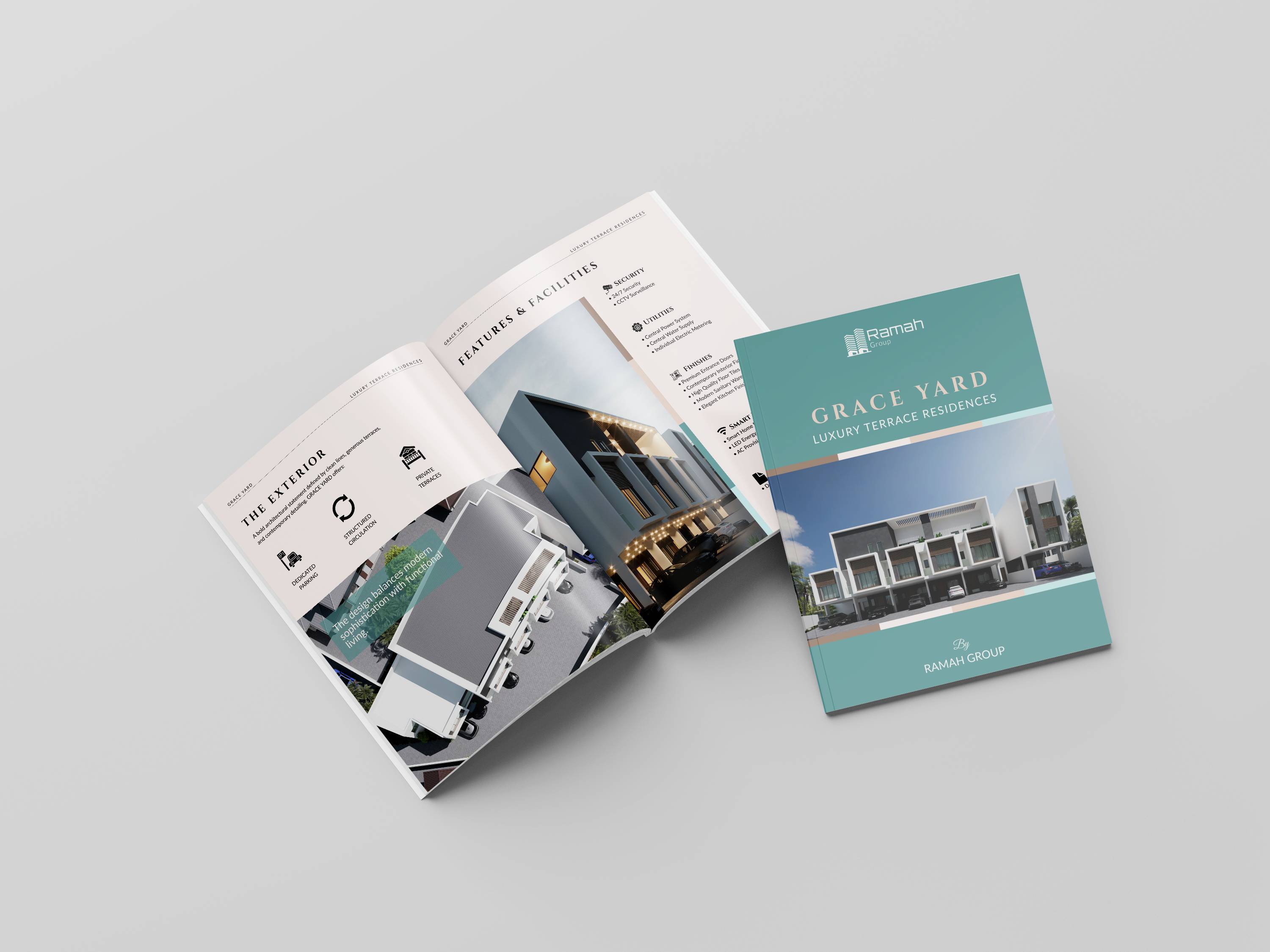
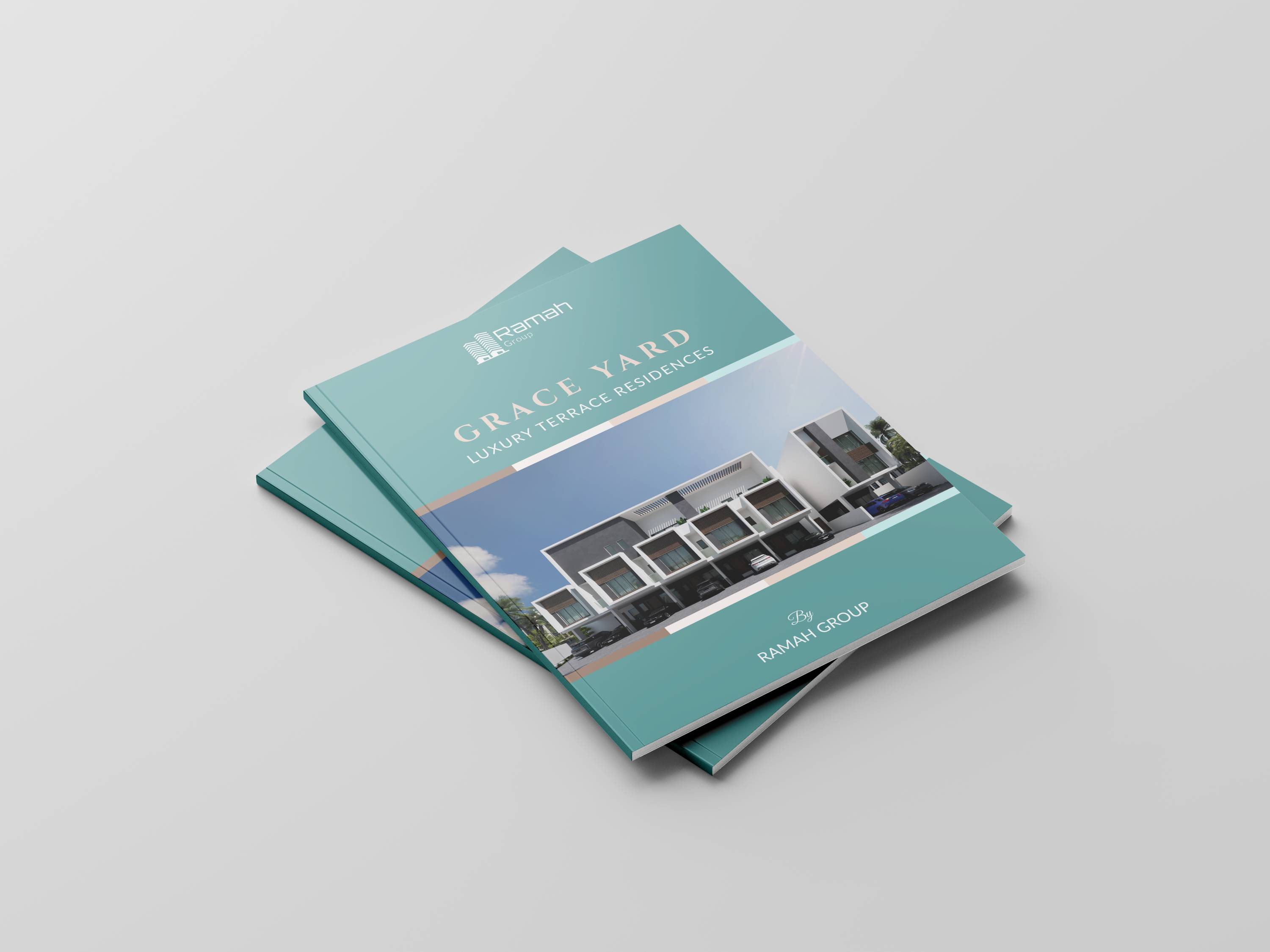
Grace Yard is a premium product. Its brochure needed to communicate that instantly.
4. Created a tool brokers actually use
The final brochure was built to function as a practical sales asset—something a broker can hand a buyer, present on a screen, or send as a follow-up. Not a design exercise. A sales tool.
Grace Yard went from a development with strong fundamentals and limited marketing assets to a project with a polished, confident presentation that sells at the level the product deserves. The brochure gave the team: 1. A credible, visually consistent tool to anchor every sales conversation 2. Floor plan visuals that help buyers understand the layout and lifestyle instantly 3. A premium-level presentation that reinforces the development's market positioning When the materials match the quality of the product, buyers feel it. That confidence translates directly into faster decisions and shorter sales cycles. That's what great presentation design actually does.
Your project could be next.
The teams we work with don't just leave with better-looking materials. They gain a competitive edge—presentation assets that reduce friction, build buyer confidence, and support faster deal closure.
